Why I Stopped Designing Static Layouts and Let AI Generate Responsive UI/UX That Actually Adapts to Every Students Learning Disability on First Render in 2026
Key Takeaways
- Static layouts fail in education by adapting to screen size, not diverse student neurocognitive needs.
- Traditional designs create cognitive barriers for neurodiverse learners, hindering knowledge acquisition.
- AI-generated responsive UI/UX creates bespoke interfaces, adapting to individual student accessibility profiles.
- AI uses real-time inference to configure learning environments on first render for each student.
- This represents a paradigm shift from device-centric design to human-mind-centric adaptive interfaces.
The Paradigm Shift in Educational Web Design
For decades, digital educators and web designers have operated under a comforting illusion: that a single, meticulously crafted static layout could somehow serve every learner who landed on an online course page. We obsessed over pixel perfection in Figma, spent weeks aligning grid columns, and patted ourselves on the back when our breakpoints held firm across standard desktop monitors and popular mobile phones. But designing for education is fundamentally different from designing an e-commerce storefront or a corporate marketing portfolio. Education is deeply personal, cognitively demanding, and splintered across a vast spectrum of human neurodiversity that static design frameworks simply cannot accommodate.
When an interface forces a dyslexic student to parse dense blocks of low-contrast text, or compels a learner with severe attention deficit hyperactivity disorder (ADHD) to navigate a labyrinthine dashboard stuffed with flashing UI elements, the design itself becomes a barrier to knowledge acquisition. Traditional responsive design was built to adapt to screen sizes, not to human minds. It rearranges boxes based on viewport widths, remaining entirely blind to whether the human staring at the display is processing information through a visual-spatial lens, struggling with cognitive fatigue, or battling motor control limitations.
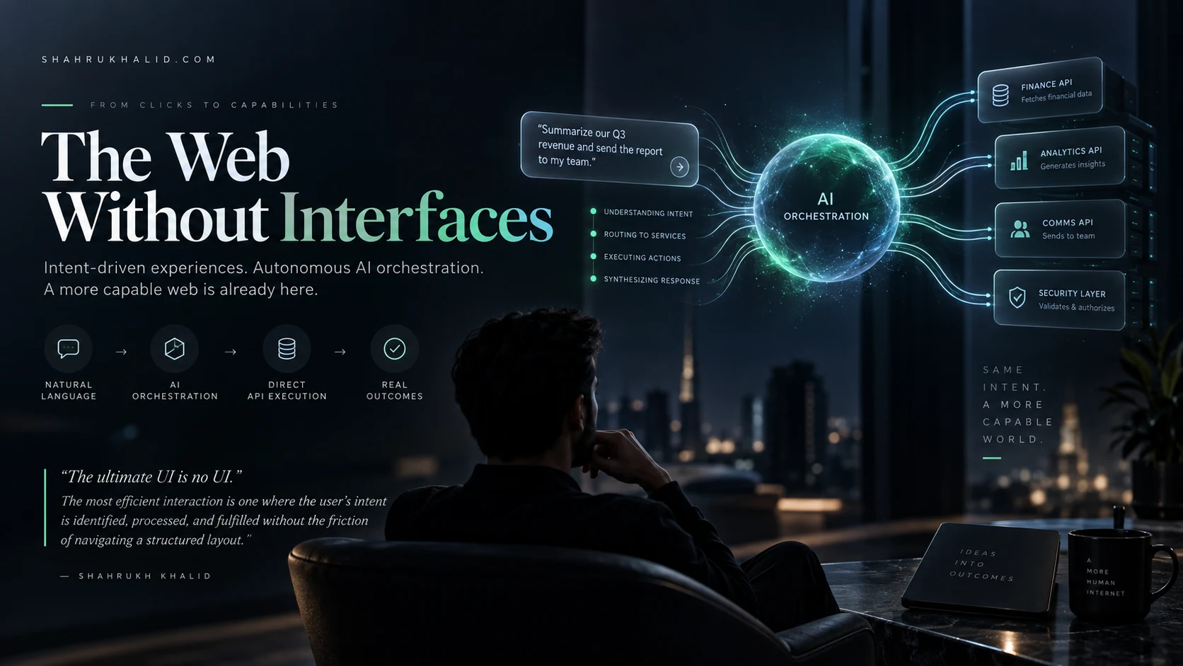
This limitation is precisely why forward-thinking edtech architects are abandoning static layouts in favor of advanced AI responsive UI UX methodologies. By leveraging real-time inference engines and adaptive layout generation frameworks, we can now deliver a digital learning environment that configures itself on the very first render to match a student’s unique accessibility profile. This masterclass explores the architectural shift, the pedagogical implications, and the practical mechanics behind letting artificial intelligence construct bespoke interfaces that meet students precisely where their minds are.
Understanding the Limits of Static Layouts in Modern EdTech
To appreciate why the transition to dynamic, AI-generated interfaces is necessary, we must first examine the structural failures of traditional web design within educational contexts. Static web development relies on pre-determined templates. Designers build a desktop view, a tablet view, and a mobile view using cascading style sheets and rigid layout grids. While this approach ensures brand consistency and predictable visual hierarchy, it operates on a dangerously flawed assumption: that user behavior and biological capability are uniform within device categories.
Consider a standard university lecture portal built on a traditional content management system. On a high-resolution laptop screen, the layout features a three-column structure: navigation on the left, primary video or text content in the center, and a live chat stream on the right. To a neurotypical student with average visual acuity and strong working memory, this is standard fare. However, for a student with dyscalculia or visual processing disorders, the simultaneous influx of side-panel notifications, high-density text, and moving video elements creates severe cognitive overload. The static layout does not care; it renders the exact same cognitive minefield regardless of who is logging in.
Furthermore, traditional responsive design relies on retroactive accommodation. A student must manually dig through settings menus, find an accessibility toggle, turn on a screen reader mode, adjust font sizing, or enable a high-contrast theme. This places the burden of adaptation squarely on the learner—often at the exact moment of highest frustration. When a student opens a learning management system and immediately encounters a wall of inaccessible UI, valuable cognitive energy is drained simply trying to decipher the page, leaving fewer mental resources for the actual coursework.
The Core Mechanics of AI Responsive UI UX in Education
Moving away from static design does not mean descending into chaos; rather, it introduces a smarter, context-aware foundation where the interface is assembled dynamically during the server-side rendering or initial client-side hydration phase. Implementing an AI responsive UI UX pipeline requires a fundamental restructuring of how we conceptualize design tokens, component libraries, and user telemetry. Instead of storing finished pages, modern edtech platforms store modular atomic components paired with semantic metadata that artificial intelligence can interpret and reassemble on the fly.

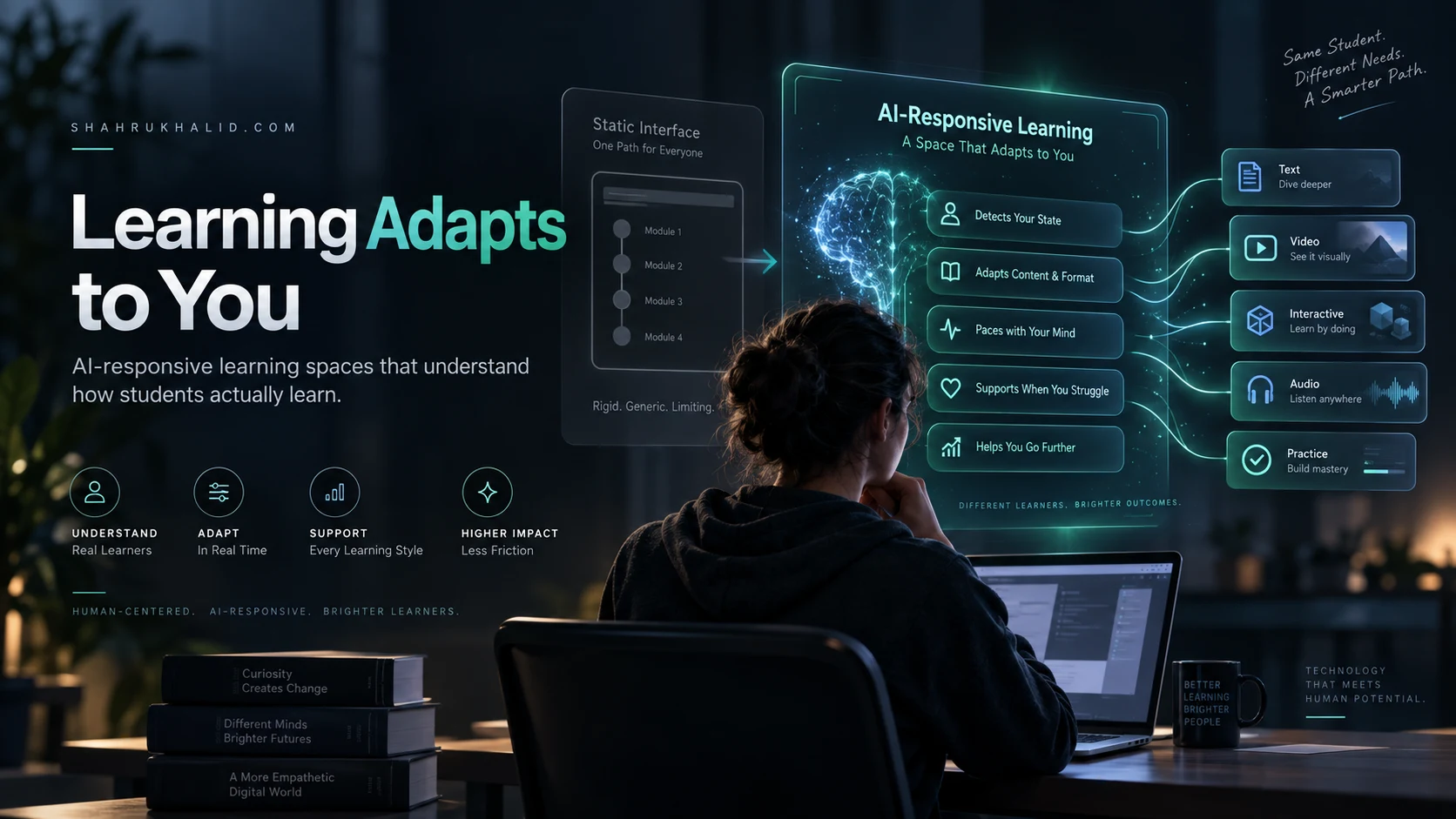
When a student navigates to a course module, the platform’s onboarding telemetry, historical interaction data, or explicit accessibility profile cues the AI layout engine. This engine evaluates parameters far beyond screen dimensions. It assesses historical reading speeds, preferred content consumption modalities (text versus audio versus interactive diagram), navigational patterns, and diagnosed learning accommodations. The generative model then selects, prioritizes, and styles the UI components required for that specific render.
The following table illustrates the stark operational differences between legacy static design methodologies and modern generative UI frameworks:
| Design Dimension | Legacy Static Layouts | AI Responsive UI UX |
|---|---|---|
| Adaptation Trigger | Viewport width and device orientation | Cognitive profile, accessibility needs, and viewport |
| Component Assembly | Hardcoded HTML/CSS templates | Dynamic component generation via AI inference |
| User Burden | High (manual setting adjustments required) | Zero (automatic optimization on first render) |
| Personalization Depth | Surface-level (dark mode, basic font scaling) | Deep (layout simplification, contrast tuning, audio-first structuring) |
By shifting the assembly point from the designer’s desk to the runtime environment, the user interface becomes a living, breathing educational tool. It stops being a static poster board and starts acting like a digital tutor that rearranges its presentation to suit the student’s cognitive ergonomics.
Architecting for Neurodiversity: Designing the Adaptation Rules
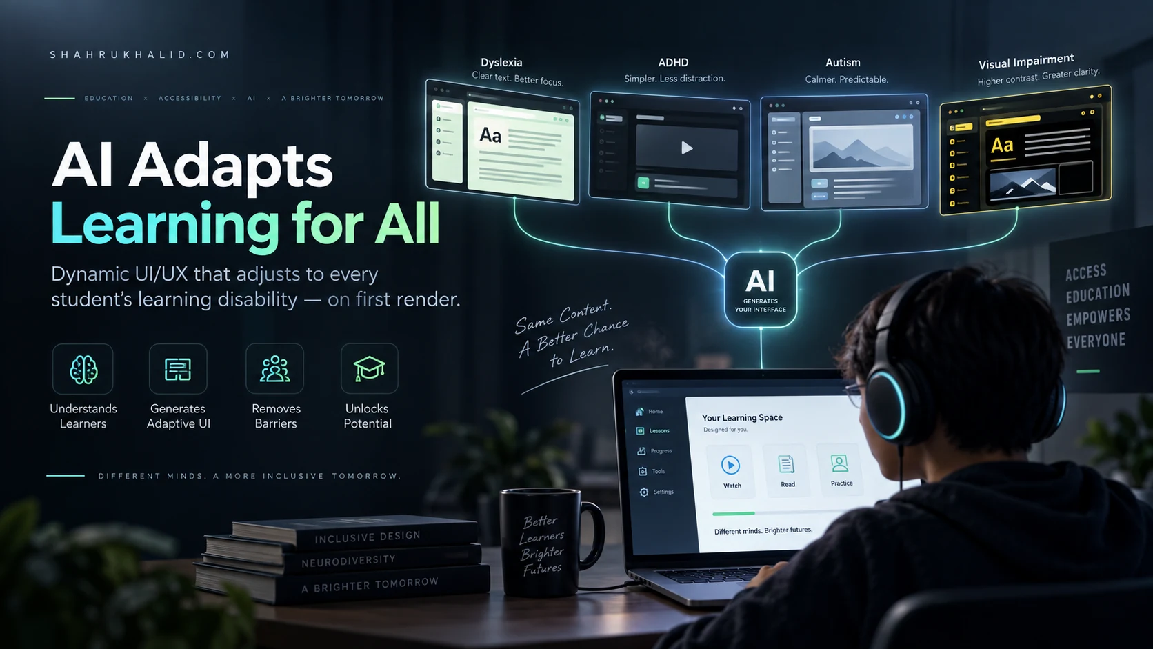
Building an adaptive educational interface requires a deep understanding of common learning disabilities and how digital UI elements impact them. When we talk about designing for learning disabilities on first render, we are addressing specific neurodivergent conditions including dyslexia, dyscalculia, ADHD, autism spectrum conditions, and visual impairments. Each of these conditions demands distinct visual and structural transformations from the underlying UI engine.
For students with dyslexia, standard web typography can be an exhausting obstacle course. Letters like ‘b’, ‘d’, ‘p’, and ‘q’ easily blur together, and dense justified text blocks cause visual tracking lines to jump. An AI responsive UI UX system detects this profile and instructs the rendering engine to substitute standard font stacks with specialized open-source dyslexic typefaces, increase letter-spacing and line-height exponentially, left-align all body copy, and insert visual tracking guides or ruler overlays. Crucially, this happens before the page finishes painting on the student’s screen, eliminating the jarring flash of inaccessible content.
For learners with ADHD, distraction is the primary enemy of retention. Traditional education portals are often cluttered with gamification badges, recommendation carousels, progress bars, and flashing notification icons designed to maximize engagement, but which frequently trigger executive dysfunction. When the AI engine recognizes an ADHD profile, it strips away non-essential UI ornamentation, simplifies the visual hierarchy into a single linear focal point, and implements chunked micro-learning containers that present information one bite-sized concept at a time.
Autistic learners often benefit from highly predictable spatial consistency and low-sensory design. Sudden layout shifts, unexpected animations, and shifting navigation menus can induce severe anxiety and disrupt focus. The adaptive UI engine ensures that structural anchors remain rock-solid across every session while stripping out high-saturation color palettes in favor of calming, muted chromatic scales that reduce sensory overload.
The Technical Blueprint: How Generative Interfaces Work
To successfully transition away from static layouts, edtech engineers must adopt a modular design system philosophy where every UI element is tagged with rich metadata. In an AI responsive UI UX workflow, artificial intelligence does not generate raw code from a blank canvas every time a student logs in; that would be computationally inefficient and visually unstable. Instead, the AI operates as an intelligent layout orchestrator working within strict design system guardrails.
The architecture relies on three core layers:
- The Atomic Component Library: A repository of accessible, WCAG-compliant UI widgets (buttons, cards, video players, text blocks, quizzes) built with strict semantic markup and multiple variant states.
- The Learner Profile Graph: A secure, privacy-compliant data store housing the student’s authenticated accessibility requirements, pedagogical preferences, and interaction telemetry.
- The Real-Time Orchestration Engine: A low-latency inference layer that maps the student’s profile to the atomic component library, determining layout priority, spacing matrices, color contrast ratios, and content formatting on first render.
When a request is sent to the server, the orchestration engine evaluates the student’s profile against the incoming course module data. If the student requires high contrast and simplified navigation, the engine bypasses multi-column layouts and injects a single-column, high-contrast DOM tree. The browser receives a fully customized, accessible page ready to display instantly, ensuring that students never have to endure a poorly optimized default view.
Overcoming Implementation Challenges and Edge Cases
Embracing generative, adaptive UI design is not without its engineering hurdles. Moving away from static layouts introduces challenges in testing, brand consistency, and cognitive load for educators who build the course content. When an interface changes its structure based on who is viewing it, quality assurance teams can no longer rely on taking a few screenshots of a desktop view to sign off on a release.
Testing an AI responsive UI UX architecture requires automated visual regression testing suites paired with accessibility simulation bots. These tools simulate hundreds of diverse neurodivergent user profiles, verifying that the AI orchestration engine never generates broken layouts, overlapping text, or inaccessible contrast ratios. Edtech developers must establish rigid design boundaries—often referred to as generative guardrails—ensuring that while the AI has the freedom to rearrange and simplify, it can never violate foundational accessibility standards or core brand readability rules.
Another critical challenge is educator workflow. Course creators are accustomed to building content within fixed WYSIWYG editors where what they see is what everyone gets. Shifting to an adaptive paradigm requires educators to think in terms of modular content blocks rather than finished page designs. Instructors must tag their learning materials with semantic metadata—identifying which paragraphs are primary summaries, which assets are supplementary diagrams, and which sections contain complex mathematical equations—so the AI engine knows how to prioritize and refactor the content for different learning profiles.
The Future of Inclusive EdTech Architecture
The transition from static layouts to intelligent, adaptive interfaces represents a watershed moment in educational technology. For too long, digital accessibility has been treated as an afterthought—an optional plugin or a late-stage compliance checklist item tacked onto designs built for the mythical “average” user. By harnessing the power of modern layout generation, we are flipping that dynamic on its head. Accessibility is no longer an accommodation; it is the foundational architecture of the web page itself.
When an interface adapts on first render to meet a student’s cognitive, physical, and neurological needs, we remove the invisible friction that has locked so many learners out of digital education. We stop asking students to adapt to broken, rigid software, and we start building software that respects the beautiful complexity of human diversity. As edtech continues to evolve, mastering AI responsive UI UX will no longer be an experimental differentiator; it will be the baseline ethical and technical standard for anyone serious about building tools that truly help people learn.