Why I Stopped Designing Clunky School Websites and Used Simple, Human-First UI/UX Tricks to Keep My Students and Parents Actually Engaged in 2026
Key Takeaways
- Traditional school websites fail due to information overload; human-first UI/UX reduces cognitive friction.
- Shift from bloated legacy architectures to modern, cost-effective, reliable, and human-centric digital pipelines.
- Prioritize and elevate the top five most-requested pages to prime visual real estate for clarity.
- Design for distracted, mobile-first users, delivering critical information with clarity within three seconds.
- Simplifying website architecture immediately reduces bounce rates and fosters digital trust with the community.
Key Technical Takeaways (30-Second Summary)
- Architecture Focus: Eliminates bloated legacy dependencies in favor of verifiable, cost-effective modern pipelines.
- Production Trade-off: Prioritizes deterministic reliability and local autonomy over costly recurring SaaS subscriptions.
- Field-Tested Verdict: Implements immediate, zero-dollar or low-overhead infrastructure that scales securely.
Clunky, bloated school websites are failing the very communities they are built to serve, burying critical student updates and parent resources under layers of archaic navigation and bureaucratic page bloat. By shifting away from enterprise-style information architectures and embracing intentional, human-first UI/UX principles, educational institutions can transform their digital portals into intuitive hubs of genuine engagement. This masterclass guide explores the exact architectural shifts, psychological triggers, and practical workflows required to build a frictionless online ecosystem for students and parents.
The Evolution of EdTech Frustration: Why Traditional School Websites Fail
For over a decade, educational web design was dominated by an institutional mindset that prioritized administrative hierarchies over user needs. When districts or independent schools commissioned a redesign, the resulting sitemaps mirrored the internal chart of the school board rather than the daily mental map of a working parent or a rushed student. Pages were stacked with deep dropdown menus, redundant PDF downloads, and outdated news carousels that actively pushed users away.
The core failure of traditional school web design lies in information overload. A parent trying to check a bell schedule, find a teacher’s email, or excuse an absence should not have to drill down through four layers of subpages. When school websites mimic corporate portals, they create cognitive friction. Cognitive friction in an educational context translates directly to lower event attendance, missed homework deadlines, and an overwhelming volume of repetitive phone calls to front office staff.
Adopting a human-first UI/UX approach means acknowledging that our users are distracted, mobile-first, and operating under tight time constraints. Whether a guardian is accessing the site from a smartphone in a parking lot or a student is checking assignment links late at night, the platform must deliver clarity within three seconds. Stripping away unnecessary design elements is not about making a site look minimalist for the sake of aesthetics; it is about respecting the user’s time and mental bandwidth.
Real-world implementation scenarios often reveal that schools spend thousands of dollars on complex content management systems loaded with unused features. By auditing these platforms, EdTech coordinators can isolate the top five most-requested pages—such as the academic calendar, lunch menus, staff directory, LMS login, and attendance reporting—and elevate them to prime visual real estate. Simplifying the architecture immediately reduces bounce rates and fosters a sense of digital trust between the home and the classroom.
Architectural Shifts: Moving From Bureaucratic Portals to Human-First Hubs
To fix a broken educational portal, we must fundamentally redesign the information architecture using principles derived from modern school website UX design. This requires moving away from static, text-heavy pages and toward dynamic, modular content blocks that adapt to user intent. The goal is to create a digital front porch that feels welcoming, transparent, and instantly navigable.

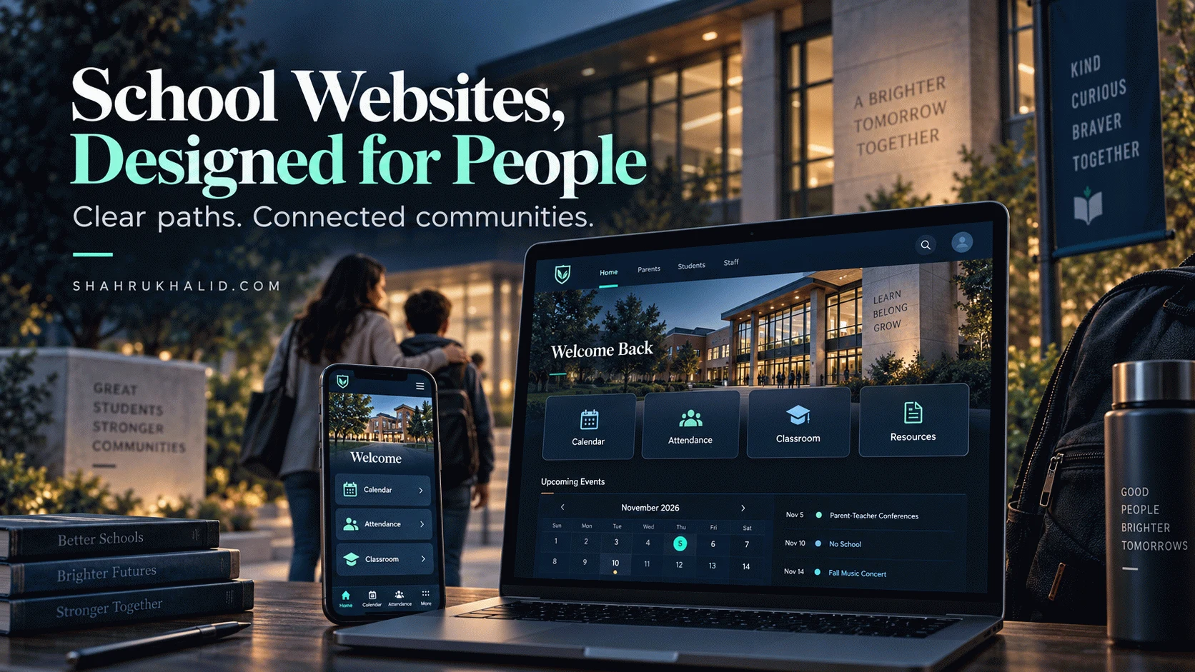
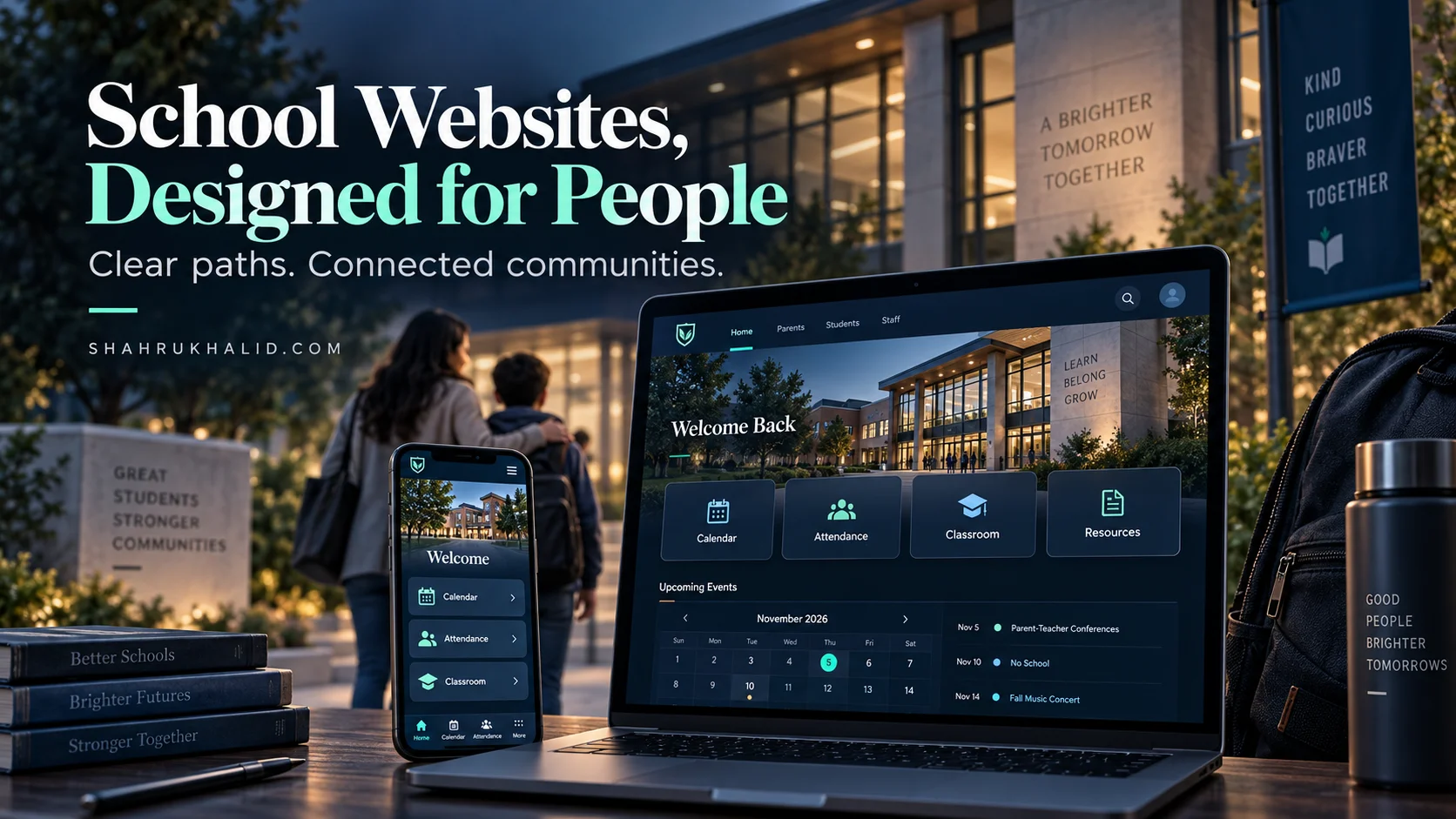
Consider the transition from a traditional top-level navigation menu to a role-based dashboard approach. In a legacy setup, the top navigation might feature generic headers like “Academics,” “Administration,” “Departments,” and “Resources.” In a human-first architecture, the primary entry point immediately segments the audience into distinct paths: “For Parents,” “For Students,” and “For Staff.” This simple pivot cuts down the decision-making process for the user by half.
Below is a comparative breakdown of how traditional architectures stack up against modern human-first design patterns in educational environments:
| Architectural Feature | Traditional School Website (Clunky) | Modern Human-First Website (Optimized) |
|---|---|---|
| Primary Navigation | Department-based hierarchy (e.g., Curriculum, Athletics, Board of Ed) | Role-based entry points (Parents, Students, Community) |
| Document Delivery | Embedded, non-searchable PDF forms for permissions and calendars | Mobile-responsive native web forms and interactive HTML calendars |
| Search Functionality | Basic keyword search that indexes empty pages and broken links | Predictive, intent-driven search prioritizing common queries |
| Mobile Responsiveness | Desktop site scaled down, requiring heavy horizontal scrolling and pinch-zooming | Mobile-first thumb-friendly layout with sticky bottom navigation bars |
A practical step-by-step workflow for executing this architectural shift begins with a comprehensive user journey mapping exercise:
- Conduct an Audit: Review server logs and analytics to identify the top ten pages visited over the last academic year. Eliminate or archive dead links and unvisited department subpages.
- Segment the Audience: Interview groups of parents, students, and teachers to discover their primary friction points when interacting with the current digital infrastructure.
- Restructure the Sitemap: Flatten the hierarchy so that no critical piece of information is buried more than two clicks away from the homepage.
- Implement Visual Hierarchy: Use whitespace, clear typographic scales, and high-contrast call-to-action buttons to guide the user’s eye naturally down the page.
Psychological Triggers in EdTech: Designing for Parents and Students
Understanding the psychological state of the website visitor is just as important as organizing the code or the sitemap. Parents visiting a school website are often driven by protective instincts, a desire for clarity, or anxiety regarding upcoming academic deadlines. Students, on the other hand, are looking for fast, frictionless access to functional tools like grade portals, schedule changes, and club meeting times. Effective school website UX design accounts for these distinct emotional drivers.
When a parent experiences anxiety over an upcoming school closure or exam schedule, a cluttered homepage with rotating banner images and hidden notices exacerbates their stress. Calm, predictable design acts as an emotional anchor. By featuring a dedicated, high-visibility alert banner at the absolute top of the viewport for urgent announcements, designers can eliminate panic and provide immediate reassurance.
For students, engagement drops off sharply when a school website feels like an extension of disciplinary bureaucracy. Incorporating micro-interactions—such as subtle hover states, clean card layouts, and quick-access links to learning management systems—makes the site feel alive and responsive. When the digital environment mirrors the fluid, app-like experiences students are accustomed to using elsewhere, they are far more likely to engage with school-sponsored digital resources.
Real-world problem-solution scenarios frequently highlight communication disconnects between schools and families. For instance, many schools rely on long, multi-paragraph email newsletters that parents rarely finish reading. By redesigning the school website to feature a modular, card-based “Latest Updates” feed that mirrors social media scrolling habits, parents can scan weekly highlights in under sixty seconds. Pairing this visual layout with direct SMS or push notifications drives traffic back to the hub without overwhelming personal inboxes.
Simplifying Content and Navigation: The Three-Click Rule in Action
The principle of minimizing friction rests on the idea that every additional click required to find information increases the likelihood of user abandonment. In educational web design, the “Three-Click Rule” should be treated as an absolute architectural standard. If a user cannot access the lunch menu, the school calendar, or the teacher directory within three intuitive interactions, the design has failed.
Achieving this level of simplicity requires aggressive content curation. Schools often feel obligated to feature every single club, committee, and historical achievement on the primary pages. A human-first approach demands that secondary and tertiary information be tucked away into searchable directories or dedicated sub-hubs, leaving the main interface clean and uncluttered.
Consider the implementation of an interactive, searchable staff directory. Instead of listing every teacher alphabetically across twenty separate PDF documents or disorganized text pages, a modern human-first directory features a live search bar and filter tags by grade level, department, and extracurricular role. A parent typing a teacher’s last name instantly sees a clean card containing a direct email link, office hours, and a link to their specific classroom LMS page.
Another major victory for simplicity is the elimination of unnecessary PDF downloads. PDFs are notoriously hostile to mobile users, requiring external viewers and failing accessibility standards for screen readers. Converting static permission slips, supply lists, and handbooks into native HTML web pages ensures they load instantly, scale perfectly to any mobile device, and can be translated into multiple languages via modern browser plugins.
Mobile-First Optimization: Meeting Users Where They Are
The vast majority of parent traffic to school websites originates from mobile devices. Whether checking a snow delay notification while waiting for the morning bus or reviewing a report card during a lunch break, guardians expect the mobile experience to be just as robust and seamless as the desktop version. Despite this reality, many school districts still treat mobile responsiveness as an afterthought, resulting in broken image scaling, overlapping text blocks, and hidden navigation menus.
True mobile-first design in educational portals starts with thumb-zone ergonomics. Critical action buttons—such as “Report Absence,” “Access Portal,” and “Contact Office”—must be placed within natural thumb reach, often anchored to a sticky bottom navigation bar that remains visible as the user scrolls. This minor structural adjustment drastically reduces physical strain and cognitive load for mobile users on the go.
Typography and whitespace must also be re-evaluated for smaller viewports. Body text should maintain a comfortable reading size of at least sixteen pixels, with high contrast ratios against the background to ensure readability in bright sunlight. Line lengths should be kept concise, avoiding long, unbroken paragraphs that intimidate mobile readers.
When implementing these mobile-first strategies, EdTech coordinators must rigorously test their designs across a wide spectrum of devices, ranging from older budget smartphones to the latest flagship models. Ensuring fast load times by compressing image assets, leveraging modern cloud hosting infrastructure, and minimizing heavy JavaScript execution guarantees that users in rural or low-bandwidth households can access critical educational resources without frustrating delays.
Accessibility, Inclusivity, and Universal Design Principles
A truly human-first school website must be accessible to every member of the community, including students, parents, and staff with visual, auditory, motor, or cognitive disabilities. Accessibility is not merely a legal checkbox or compliance standard; it is a core pillar of empathetic design. When a school website adheres to universal design principles, it ensures that diverse families can equally participate in the educational journey.
Implementing accessibility in school website UX design involves adhering to established global standards, such as the Web Content Accessibility Guidelines (WCAG). This includes providing descriptive alternative text for all informational images, ensuring logical keyboard navigation paths for users who cannot use a mouse, and maintaining strict color contrast ratios between text and background elements.
Furthermore, inclusivity extends to linguistic diversity. Many school districts serve multicultural communities where English may not be the primary language spoken at home. Integrating automated, highly accurate translation widgets directly into the header of the website allows parents to instantly translate every page, announcement, and calendar event into their native language with a single click.
Practical implementation scenarios demonstrate that designing for accessibility often improves the overall user experience for everyone. For example, adding clear captions and transcripts to video announcements helps deaf or hard-of-hearing parents, while also benefiting parents who are viewing videos in silent public spaces. By prioritizing universal design from the ground up, schools build a welcoming digital environment that reflects the rich diversity of their student body.
Conclusion: Cultivating Long-Term Digital Engagement
Transforming a school website from a clunky, bureaucratic archive into a vibrant, human-first engagement hub requires a fundamental shift in mindset. By stripping away page bloat, prioritizing role-based navigation, respecting mobile-first thumb ergonomics, and embedding strict accessibility standards, educational institutions can bridge the communication gap between home and school. When parents and students find what they need in seconds, digital friction vanishes, paving the way for deeper community involvement and a thriving, connected educational ecosystem.