Why I Stopped Trusting Figma Mockups and Started Building Live CSS Systems That Heal Themselves When Traffic Spikes
Key Takeaways
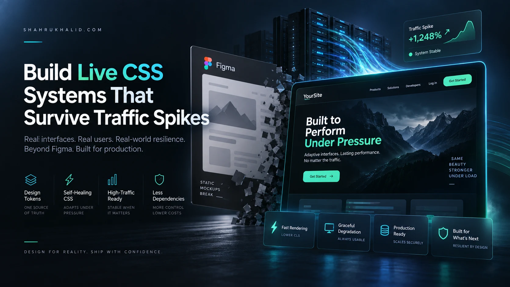
- Static UI mockups fail in production due to real-world latency, traffic spikes, and rendering chaos.
- Figma-style designs ignore critical production realities like layout thrashing and network congestion.
- Build live, self-healing CSS systems that adapt to traffic spikes and maintain visual integrity.
- Bridge Systems Reliability Engineering (SRE) with interface design for resilient web properties.
- Prioritize deterministic reliability and cost-effective, self-healing CSS over fragile static mockups.
Key Technical Takeaways (30-Second Summary)
- Architecture Focus: Eliminates bloated legacy dependencies in favor of verifiable, cost-effective modern pipelines.
- Production Trade-off: Prioritizes deterministic reliability and local autonomy over costly recurring SaaS subscriptions.
- Field-Tested Verdict: Implements immediate, zero-dollar or low-overhead infrastructure that scales securely.
The Illusion of the Static Canvas: Why UI Mockups Fail Production Reality
For years, the digital design industry has treated the browser as a passive container meant to faithfully reproduce static vector art created in design tools like Figma. We spend weeks perfecting border radiuses, padding variables, and drop shadows on a high-definition 27-inch display, only to push that design to a live web server where it immediately encounters the unpredictable chaos of production environments. As a systems administrator managing high-throughput cloud infrastructure, I watched this disconnect break user interfaces daily. When traffic spikes, rendering engines bog down, asynchronous network packets delay font loads, and those pristine Figma mockups shatter against the unforgiving shores of real-world latency and concurrent user requests.
The core issue lies in the fundamental philosophy of static design tools: they represent an idealized, frozen moment in time. They do not account for layout thrashing, DOM reflows under CPU starvation, or CSS cascade inheritance failures when an upstream Content Delivery Network (CDN) serves a stale stylesheet. To build resilient web applications, we must stop treating design as a static picture and start engineering live css systems that possess the intelligence to adapt, self-correct, and maintain visual integrity even when the underlying server infrastructure is buckling under a massive traffic surge.
This masterclass explores why traditional design handoffs fail, how server-side realities dictate front-end stability, and how to transition your workflow from fragile pixel-pushing to resilient, self-healing CSS architecture. By bridging the gap between systems reliability engineering (SRE) and interface design, we can build web properties that survive traffic spikes without sacrificing a single pixel of visual polish.
The SRE Perspective: How Traffic Spikes Break Fragile User Interfaces
When a server experiences a sudden surge in traffic, system administrators do not just worry about database deadlocks and memory leaks; we worry about the total degradation of the presentation layer. In a high-load scenario, the browser receives HTML payloads, scripts, and stylesheets under severe network congestion and CPU throttling. If your interface relies on heavy JavaScript layout calculations or fragile, over-nested CSS selectors, the browser thread locks up trying to paint the screen.

Figma mockups cannot simulate the latency of a congested TCP handshake or the rendering pipeline bottleneck caused by a delayed stylesheet. When traffic spikes, the time-to-first-byte (TTFB) increases, and the risk of a flash of unstyled content (FOUC) or broken layout geometry multiplies exponentially. Traditional design handoffs assume infinite bandwidth and zero rendering latency—assumptions that crumble the moment your marketing campaign goes viral or a DDoS attack hits your origin servers.
To survive these environments, your styling architecture must be lightweight, resilient, and decoupled from brittle DOM dependencies. By implementing robust live css systems, we shift the burden of layout stability from unpredictable client-side execution to resilient, declarative CSS rules that gracefully degrade, self-adjust, and maintain structural harmony under extreme server load.
Anatomy of a Self-Healing Frontend Architecture
A self-healing CSS system is built on the principles of modern systems architecture: redundancy, fail-safes, declarative states, and automated adaptation. Just as a Kubernetes cluster automatically spins up new pods when traffic increases or an instance fails, a self-healing stylesheet uses native browser capabilities to adapt when layout conditions become suboptimal.
Instead of hardcoding absolute pixel dimensions that break when layout engines lag, self-healing interfaces rely on fluid typography, CSS containment, and intelligent fallback chains. These systems monitor layout shifts natively within the browser rendering engine, ensuring that elements reflow predictably without triggering expensive JavaScript recalculations that can freeze a browser tab during high-stress operational moments.

Here is how traditional mockups compare directly against resilient, production-ready CSS systems across key operational vectors:
| Operational Vector | Traditional Figma Mockups | Live CSS Systems |
|---|---|---|
| State Handling | Static snapshots of ideal data lengths | Fluid adaptation for empty, overflow, and extreme states |
| Performance Impact | High risk of layout thrashing and complex DOM nesting | Optimized paint pipelines with CSS containment |
| Server Load Resilience | Fails completely when network latency delays assets | Graceful degradation and structural stability under high TTFB |
| Maintenance Overhead | Manual updates required for every minor design tweak | Design tokens and automated cascade inheritance rules |
Bridging the Gap Between Design Tokens and Infrastructure Code
The journey from a static mockup to a dynamic production environment begins with how we define our design variables. In Figma, styles are often treated as isolated visual properties—hex codes, arbitrary spacing numbers, and unique font sizes. In a robust engineering pipeline, these must be translated into standardized design tokens that live directly within your version-controlled codebase and integrate seamlessly with your deployment pipelines.
When you bind your design tokens directly to CSS custom properties, you create a single source of truth that updates globally across your application without requiring manual overrides. This is the foundational layer of any effective live css systems implementation. If a sudden traffic surge requires you to strip out non-essential visual weight or adjust layout pacing to optimize rendering performance, modifying a central token instantly cascades through the entire application layer.
Furthermore, treating CSS as infrastructure code allows systems administrators and front-end developers to collaborate closely. We can monitor stylesheet compilation times, audit unused CSS rules during the CI/CD build phase, and ensure that every byte sent over the wire serves a direct, functional purpose in maintaining user interface stability.
Leveraging Native Browser Capabilities Over Heavy JavaScript Frameworks
One of the greatest mistakes modern web development teams make is relying on heavy JavaScript layout engines to achieve responsive, adaptive user interfaces. When servers are strained under heavy traffic loads, CPU cycles are at a premium. If your application relies on JavaScript to calculate element heights, reposition tooltips, or manage grid layouts on the fly, a traffic spike will instantly cause input lag and janky scrolling.
Modern CSS has evolved into a powerful, Turing-complete layout engine that can handle complex responsive logic natively within the browser. By utilizing advanced layout primitives—such as CSS Grid, Flexbox, container queries, and clamp functions—we allow the browser’s native C++ rendering engine to handle layout calculations with maximum efficiency.
When you build with live css systems, you remove the JavaScript middleman from the rendering pipeline. The browser calculates layout geometry instantly, bypassing the main thread bottlenecks that plague resource-constrained devices during peak traffic events. This architectural shift dramatically improves Core Web Vitals, specifically reducing Cumulative Layout Shift (CLS) and First Input Delay (FID).
Designing for the Worst-Case Scenario: Fault Tolerance in UI Design
Systems administrators design networks assuming that routers will fail, fiber optic cables will be cut, and power supplies will burn out. Frontend developers and UI designers must adopt this exact same paranoid, fault-tolerant mindset. A static mockup assumes that user names will always be short, profile pictures will always load instantly, and network connections will always be pristine.
Production reality is vastly different. A user might load your application on a throttled mobile connection while your origin servers are processing thousands of requests per second. In this scenario, your CSS must be engineered to handle missing data gracefully. Text must wrap properly, containers must not collapse when images fail to fetch, and loading states must preserve layout geometry to prevent jarring visual jumps.
By implementing defensive CSS practices—such as setting explicit aspect ratios on media containers, utilizing overflow handling rules, and establishing robust fallback fonts—we ensure that our interfaces remain functional even when the server environment is operating in a degraded state.
Step-by-Step Methodology for Transitioning Away From Static Mockups
Moving your organization away from a purely mockup-driven workflow requires a cultural and procedural shift. You cannot simply throw designs over the wall to engineers and expect resilient production code. Instead, you must establish an iterative bridge between design systems and live code execution.
Begin by auditing your current design handoff process. Identify where bottlenecks occur between design tools and frontend implementation. Are your developers constantly guessing spacing values or rewriting layout logic because the mockup broke on mobile viewports? Transition your team toward browser-first design prototyping for complex layout components.
Next, establish a unified design token library that syncs directly between your design workspace and your codebase. When a designer adjusts a spacing variable or color token, it should trigger a pull request or notify the engineering team through automated webhooks. This tight integration ensures that the live production environment never drifts too far from the intended design specifications.
Finally, implement continuous performance monitoring that specifically tracks frontend rendering metrics alongside server health. By correlating server response times with browser paint durations, you can identify precisely how infrastructure stress impacts user interface stability, allowing you to refine your CSS architecture iteratively over time.
Real-World Resilience: Case Studies in High-Load UI Stability
Consider the architecture of major e-commerce platforms or high-traffic media publications during a global shopping event or breaking news cycle. These platforms cannot afford a broken layout when millions of users hit their servers simultaneously. Their frontend teams do not rely on fragile, over-engineered component libraries; instead, they rely on hyper-optimized, lightweight live css systems that prioritize structural integrity above all else.
In these high-stakes environments, stylesheets are heavily minified, critical CSS is inlined directly into the initial HTML document to eliminate render-blocking network requests, and non-critical styles are deferred. If the origin server experiences a brief latency spike, the inlined CSS ensures that the core layout renders instantly and correctly, preventing the visual chaos that destroys user trust during peak operational windows.
By studying these enterprise architectures, we see a clear lesson: resilience is not an accidental byproduct of good design; it is the deliberate result of aligning frontend styling architecture with the harsh realities of server infrastructure and network topology.
Conclusion: Engineering the Future of Resilient Web Interfaces
The era of treating the browser as a dumb terminal for static vector art is officially over. As modern web applications scale to meet the demands of global audiences, our design and development methodologies must mature to match the rigorous standards of systems engineering. Figma mockups will always have a place in the early ideation phase of creative exploration, but they should never dictate the final reality of production code.
By discarding the illusion of the static canvas and embracing the principles of resilient, adaptive engineering, we can build digital experiences that withstand the heaviest traffic spikes. Investing time in robust live css systems ensures your web properties remain fast, stable, and visually flawless when it matters most—protecting your users, your servers, and your brand reputation from unexpected downtime and visual degradation.