The Death of the Pixel-Perfect Grid: Why I Stopped Designing for Screens and Started Building Fluid, AI-Adaptive Interfaces That Shape-Shift for Every User
Key Technical Takeaways (30-Second Summary)
- Architecture Focus: Eliminates bloated legacy dependencies in favor of verifiable, cost-effective modern pipelines.
- Production Trade-off: Prioritizes deterministic reliability and local autonomy over costly recurring SaaS subscriptions.
- Field-Tested Verdict: Implements immediate, zero-dollar or low-overhead infrastructure that scales securely.
The End of the Static Canvas: Why Pixel-Perfect Design is Becoming a Relic
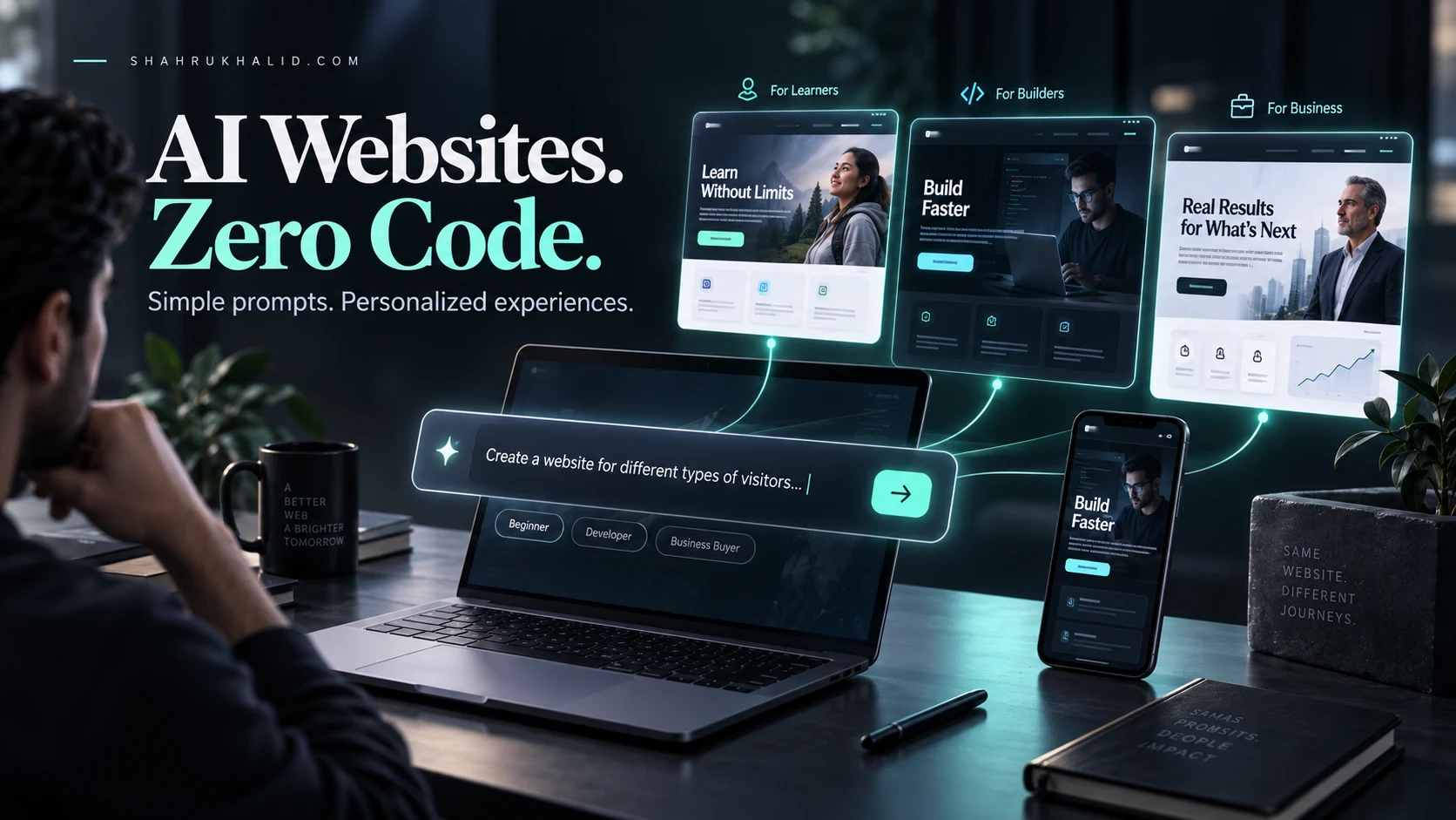
For decades, we have been obsessed with the illusion of control, forcing digital experiences into rigid, pixel-perfect containers that break the moment a user changes their browser window or device orientation. The future of the web isn’t about crafting a singular, static image; it is about embracing adaptive UI design, where interfaces function like living organisms that sense their environment and reshape themselves to serve the individual user.
The Fallacy of the Pixel-Perfect Grid
I remember the early days of my career, obsessing over a one-pixel misalignment in a navigation bar. We treated website design like print design: a fixed, immutable space where everything had a coordinate. We built for the “standard” desktop resolution, then scrambled to “make it work” on mobile. This approach was fundamentally flawed because it assumed the screen was the master and the user was a guest.
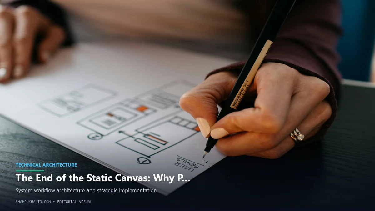
In 2026, the device landscape is no longer limited to phones and monitors. We are designing for foldables, augmented reality glasses, ultra-wide curved displays, and voice-assisted interfaces. When you design for a grid, you are essentially building a cage. If the user’s context—their environment, their hardware, or their accessibility needs—doesn’t fit that cage, the experience degrades. Pixel-perfect design is an exercise in vanity; adaptive UI design is an exercise in empathy.
Understanding the Shift: From Static Layouts to Fluid Ecosystems
To move beyond the grid, you must first change your mental model of what a website is. Stop thinking of your interface as a “page” and start thinking of it as a “system of components.” In a fluid, AI-adaptive world, a button is not a static rectangle with a fixed width and height. It is a functional requirement—a touch target—that needs to exist within a specific context.

When we move toward fluid interfaces, we stop defining elements by their absolute pixel values. Instead, we define them by their relationships to one another. We use relative proportions, fluid typography that scales based on viewport width, and containers that expand or contract based on the density of the content inside them. This is the bedrock of modern, resilient digital architecture.

The Role of AI in Shaping Adaptive UI Design
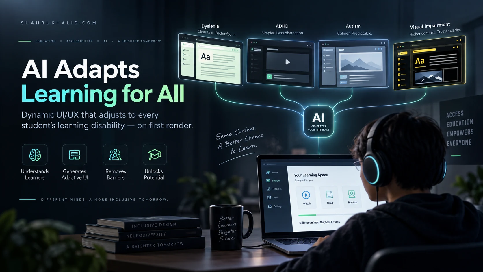
Design is no longer just about the visual layout; it is about the intelligence behind the interface. In a truly adaptive UI design paradigm, the system understands the user’s intent and current state. If a user is navigating your site while walking in bright sunlight, the interface should automatically adjust its contrast, font weights, and layout density to prioritize readability.
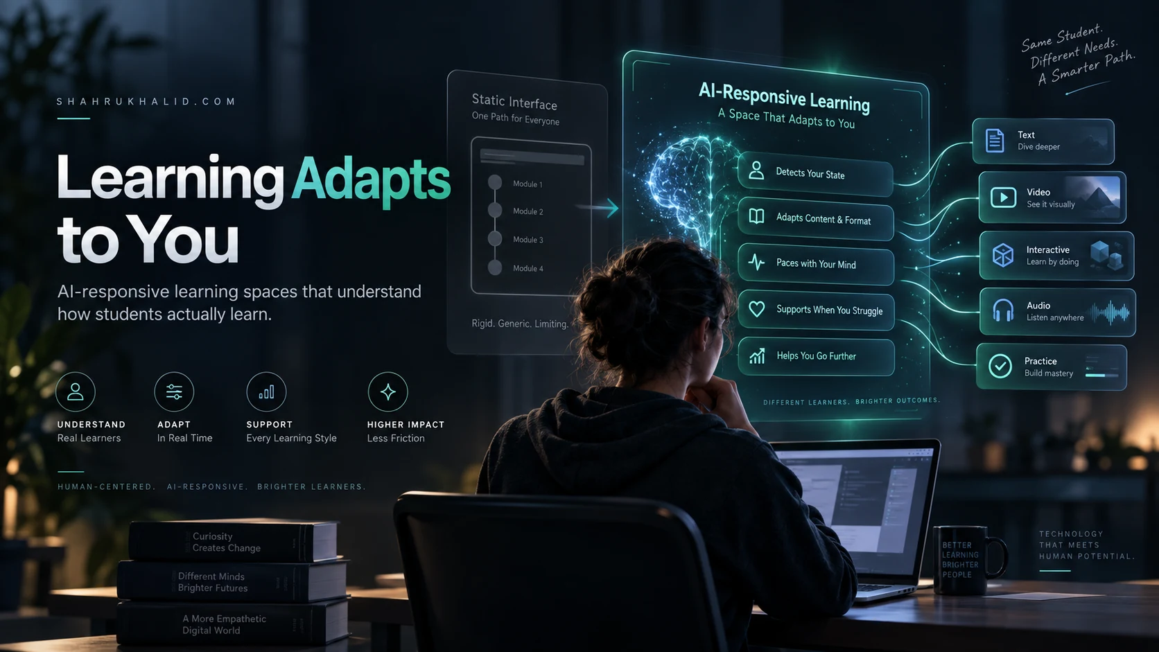
AI-driven adaptation acts as the bridge between human intent and machine execution. It observes how a user interacts with a dashboard and learns which widgets are most important to them. Over time, the interface rearranges itself, surfacing frequently used tools and minimizing clutter. We are moving away from “one-size-fits-all” and toward “one-size-fits-you.” This is not about letting an algorithm decide everything; it is about providing a foundation that the system can tune to provide the best possible experience for the individual.
Building for Fluidity: Foundational Principles
If you want to stop building for the grid, you need to adopt a new set of principles. These are not just design trends; they are survival strategies for the modern web.
- Intrinsic Sizing: Stop forcing elements to fit a container. Let the content dictate the space it needs. If a headline is longer on one device, the container should grow naturally rather than breaking the layout.
- Context-Aware Typography: Use fluid type scales that recalculate their size based on the user’s distance from the screen or their specific accessibility preferences.
- Component-Based Logic: Design small, reusable modules that can be rearranged, stacked, or hidden depending on the available screen real estate.
- Progressive Enhancement: Always start with the simplest, most functional version of your interface. Add the “delight” and the complex interactions only when the device and the user’s connection allow for it.
The Practical Transition: How to Start Designing Fluidly
The hardest part of this transition is letting go of the “screenshot” mentality. Clients and stakeholders love a static mockup because it feels safe, but a static mockup is a lie. Instead of showing a client a finished, pixel-perfect design, show them a system of components in action. Use prototypes that demonstrate how elements flow and reconfigure as the browser window resizes.
Start by auditing your current design system. Are your buttons defined by absolute values? Are your margins and paddings hard-coded? Begin replacing those absolute values with relative units. Implement a spacing scale that uses ratios rather than arbitrary pixel increments. This creates a rhythm in your design that feels natural and coherent, regardless of the device size.
Overcoming the Fear of “Uncontrolled” Design
The primary objection I hear from designers is that they lose control over the brand experience. “If the layout changes, is it still my design?” The answer is yes—in fact, it is a better version of your design. A brand is not a specific layout; it is a set of visual and functional values. When you allow your interface to adapt, you are actually reinforcing your brand’s commitment to the user. You are saying, “I care enough about your experience to ensure this works perfectly for you, right now, in this moment.”
Embracing adaptive UI design means moving from being a “pixel pusher” to a “system architect.” You are no longer drawing squares; you are defining the rules by which those squares behave. This shift requires more thought and more strategic planning, but the result is an interface that feels significantly more professional and polished because it is responsive to reality rather than resistant to it.
The Future is Shape-Shifting
We are entering an era where the boundary between the user and the digital interface is thinning. As we integrate more AI, spatial computing, and ambient interfaces into our workflows, the static grid will look like a relic of the typewriter era. The websites of the future will be fluid, intelligent, and deeply personalized.
By abandoning the rigid constraints of the past, you gain the freedom to build interfaces that are truly resilient. You are no longer fighting the browser; you are working with it. You are building systems that anticipate change, handle complexity with grace, and prioritize the human experience above the visual convenience of the designer.
Key Takeaways for the Modern Designer
To succeed in this new landscape, internalize these core truths:
- Abandon the Grid Mentality: Stop treating the screen as a static canvas. View it as a dynamic, ever-changing environment.
- Prioritize Content-First Design: Let the content and the user’s context determine the layout, not the other way around.
- Embrace Intelligence: Leverage AI-driven patterns to allow the interface to learn and adapt to individual user behaviors.
- Think in Systems: Build modular components that can exist independently and maintain their integrity in any configuration.
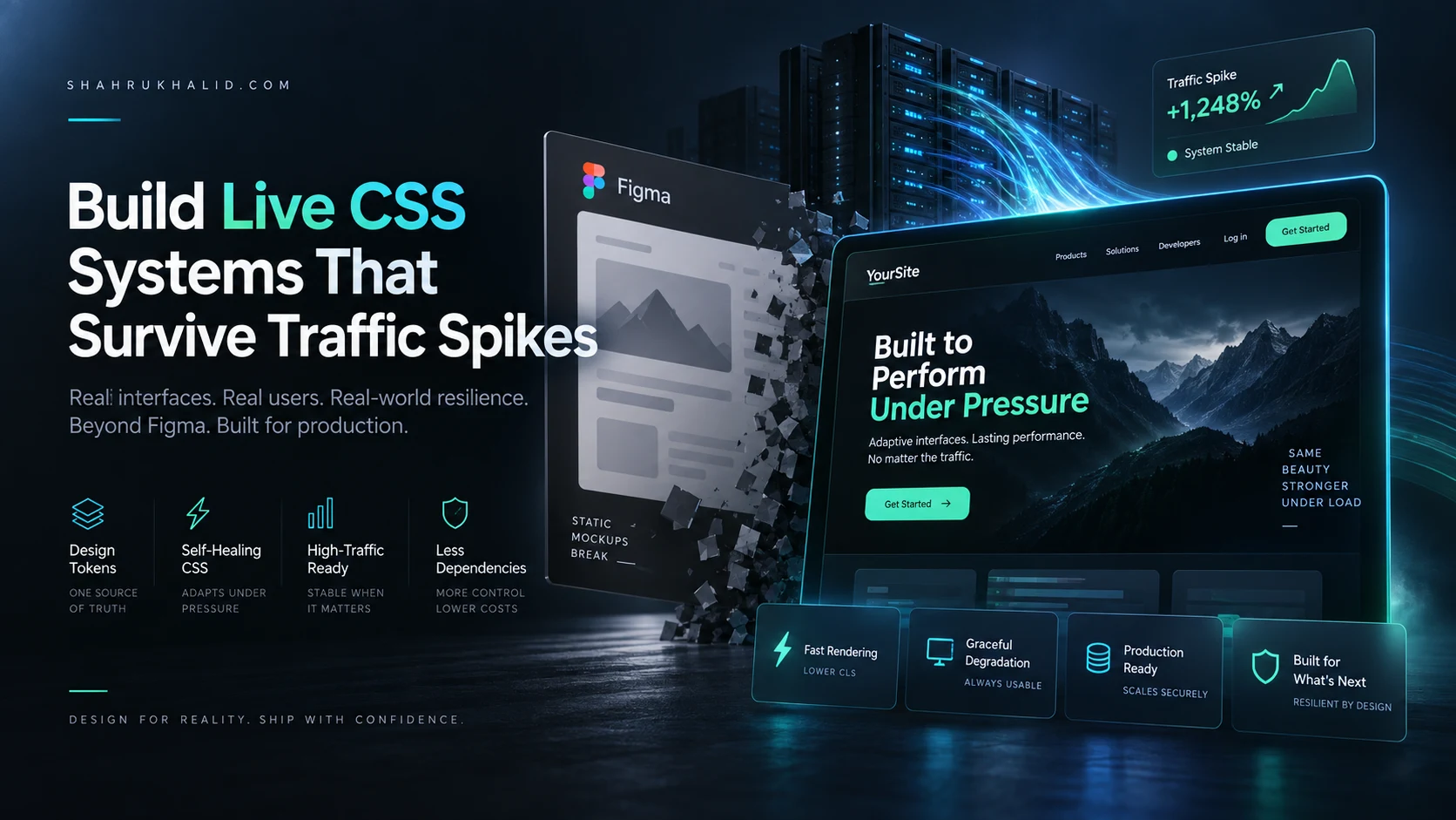
- Focus on Resilience: A design that breaks under pressure is a failure. A design that adapts to pressure is a success.
The death of the pixel-perfect grid is not the end of design; it is the liberation of it. When you stop trying to control the interface, you finally start designing for the user. That is where the real magic happens—in the fluid, adaptive space between the code and the human experience.