Your 2026 Canva Masterclass: K-12 International Students Guide to Visual Storytelling & Collaborative Success

Key Takeaways
- Visual storytelling is crucial for effectively communicating complex ideas in a noisy 2026 world.
- Canva K-12 Visual Storytelling transforms projects into opportunities for unique voice and collaboration.
- Visual storytelling uses diverse media (images, charts, colors) to engage deeply, beyond dry text.
- Understanding the 'why' of visual storytelling makes mastering the 'how' more powerful and intuitive.
- For international students, visuals serve as a universal language across diverse cultures and perspectives.
I want to take you back for a moment. When I was a student, a big project meant endless nights with textbooks, a word processor, and maybe, if I was feeling fancy, some clipart I’d painstakingly place into a document. The final result was often a dense wall of text that I’m not even sure my teachers enjoyed reading. It felt like a chore. Today, as we look towards 2026 and beyond, the world you’re stepping into communicates differently. It communicates in visuals, in stories, in shared digital spaces. This is why we’re here. This guide is your masterclass to not just using a tool, but mastering a skill: the art of Canva K-12 Visual Storytelling. We’re going to transform your school projects from obligations into opportunities—opportunities to showcase your unique voice, collaborate with friends across the globe, and create work that you are genuinely proud of. Let’s begin.
Comprehensive Foundations & Concept Primer
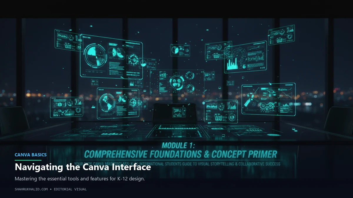
Before we dive into the nuts and bolts of clicking buttons and dragging elements, we need to build a strong foundation. Think of this module as learning the rules of a new sport. You wouldn’t just run onto a football pitch without knowing what a goal is, right? The same applies here. Understanding the ‘why’ behind visual storytelling will make the ‘how’ infinitely more powerful and intuitive. We’re going to demystify the core concepts and show you why this skill is one of the most critical you’ll develop during your K-12 journey, especially as an international student.
Why Visual Storytelling is Your Superpower in 2026
Let’s be honest: the world is noisy. We are bombarded with information every single second. In this environment, your ability to capture attention and convey a message clearly and quickly is a legitimate superpower. By 2026, this will be even more true. The future of work, academics, and even social connection will lean heavily on those who can translate complex ideas into compelling visual narratives.
So, what is visual storytelling? At its heart, it’s the practice of using visual media—images, illustrations, charts, videos, colors, and layouts—to tell a story. It’s the difference between reading a dry, text-only description of the Amazon rainforest and seeing a stunning infographic that shows you the layers of the canopy, the animals that live there, and the impact of deforestation with powerful, at-a-glance charts. One informs you; the other makes you feel something. It engages your brain on a much deeper level.
For you, as an international student, this skill is doubly important. You navigate a world of diverse cultures, languages, and perspectives. Visuals are a universal language. A well-designed graph showing climate change data is understood in Tokyo just as it is in Toronto. A powerful photograph in a history presentation can evoke an emotional response that transcends language barriers. This is how you bridge gaps, share your unique perspective, and connect with peers and teachers from all over the world. It’s a tool for inclusion and a platform for your voice.
This aligns perfectly with the ethos of modern education. Curriculums like the International Baccalaureate (IB) don’t just want you to memorize facts; they encourage you to become a certain type of person. The IB Learner Profile, as detailed on `ibo.org`, celebrates students who are “Communicators,” “Thinkers,” and “Risk-takers.” Mastering K-12 visual communication skills is a direct pathway to embodying these traits. You’re not just writing a report; you’re communicating an idea. You’re not just finding images; you’re thinking critically about which ones best support your argument. You’re not just using a template; you’re taking a risk by trying a new format, like a video or an interactive website, to tell your story in a more impactful way.
The Core Principles of Design (Without the Boring Jargon)
“Design” can sound like a scary, exclusive word reserved for artists. It’s not. Design is simply about making intentional choices to create a better experience for your audience. Let’s break down the four most important principles with simple analogies.
1. Hierarchy: The "Movie Poster" Principle
Think about a movie poster. What’s the first thing you see? Usually, it’s the big, bold title. Then, your eyes move to the main image of the star actor. After that, you might notice the names of other actors, and finally, the tiny block of text at the bottom with the release date and credits. This is hierarchy in action. The designer has made deliberate choices to guide your eye through the information in order of importance.
- In your projects: This means making your main heading the biggest and boldest. Your subheadings should be smaller, and your body text smaller still. Use size, color, and placement to tell your reader, “Hey! Look at this first, then this, then this.” It makes your information digestible and prevents your audience from feeling overwhelmed.
2. Color Theory: The "Outfit" Principle
You wouldn’t wear a neon green shirt with bright orange pants and a purple hat, would you? (Unless it’s for a specific costume party!) We instinctively know that some colors work well together, creating a feeling of harmony (like blue and white), while others clash and create tension. Color theory is the science behind this.
- In your projects: You don’t need to be a color scientist. Canva has a secret weapon for this: the color palette generator. You can upload a photo you like, and it will pull out a beautiful, harmonious set of colors for you to use. A great pro-tip is to stick to a simple palette of 2-3 main colors. One dominant color for backgrounds or large shapes, a secondary color for accents and highlights, and a neutral color (like grey, white, or black) for text. This creates a professional and cohesive look.
3. Typography: The "Voice" Principle
The fonts you choose are like the tone of voice you use when speaking. A big, blocky, all-caps font feels like you’re SHOUTING. A delicate, cursive script feels elegant and personal. A clean, simple font like Helvetica or Arial feels clear, direct, and modern.
- In your projects: The biggest rookie mistake is using too many different fonts. It’s like having five people talking at once. The best practice is to choose a “font pairing.” Pick one distinct font for your headings (the “display” font) and a different, easy-to-read font for your body text (the “paragraph” font). Canva often suggests good pairings for you. This simple choice brings an incredible amount of clarity and professionalism to your work.
4. Layout & White Space: The "Tidy Room" Principle
Imagine two rooms. One is cluttered with furniture, clothes on the floor, and books stacked everywhere. The other is neat, with clear pathways, organized shelves, and space to move around. Which room feels more calming and easier to be in? The tidy one, of course. White space (or negative space) in design is the “empty” area around your text and images. It’s not wasted space; it’s breathing room.
- In your projects: Resist the urge to fill every single corner of your page. Group related items together. For example, place an image close to the text that describes it. Leave clean margins around the edges of your slide or document. This “tidiness” makes your layout feel intentional, reduces cognitive load for your reader, and makes your key points stand out more.
By keeping these four simple principles in mind—Hierarchy, Color, Typography, and Layout—you’re no longer just decorating a page. You are designing a communication experience. You are guiding your audience, setting a mood, and ensuring your message is heard loud and clear.
Prerequisites & Complete Environment Setup
Alright, theory time is over! Let’s get our hands dirty and set up your creative command center. This module is all about getting you from zero to ready-to-create. We’ll walk through the process step-by-step, ensuring your digital workspace is perfectly configured for success. Think of this as preparing your kitchen before you start cooking: getting out the right bowls, preheating the oven, and organizing your ingredients. A little prep work now makes the creative process smooth, fast, and fun.
Step 1: Signing Up for Your Canva for Education Account
First things first, you need access to the magic. Canva has a fantastic program called Canva for Education, which gives students and teachers access to all the premium features for free. This includes millions of premium images, fonts, graphics, videos, and powerful tools like the Background Remover and Magic Resize. It’s a complete game-changer.
How to Get Access
- Check with Your School: The easiest way is if your school or a specific teacher has already signed up for Canva for Education. They can send you an invitation link directly to your school email. If they have, simply click the link, follow the prompts, and you’re in! Your school’s technology director, who manages the campus tech stack (something a consultant like Shahrukh Khalid at `shahrukhalid.com` helps schools design), often orchestrates these rollouts.
- Sign Up Manually: If your school hasn’t set it up yet, you can still get access.
- Go to `canva.com/education`.
- Click on the “Students” tab and then “Get Verified.”
- You’ll be prompted to sign up with your school email address. It’s crucial to use the email address your school gave you (e.g., `your.name@yourschool.edu`). This is how Canva verifies you’re a real student.
- Follow the on-screen instructions. You might need to provide some simple information to complete the verification process.
Verification Check: How do you know you have the Education account? When you’re logged in, look for a small graduation cap icon 🎓 next to your profile picture or in your account settings. If you see that, you’ve unlocked the full power of Canva Pro, for free. You won’t see watermarks on premium elements, and you’ll have access to everything.
Step 2: A Guided Tour of Your Canva Dashboard
Once you’re logged in, you’ll land on your Canva dashboard. At first, it might look like a lot is going on, but it’s actually organized very logically. Let’s break it down.
Visual Card: Your Canva Dashboard
- Top Navigation Bar (The “What do you want to create?” bar): This is your starting point. The big search bar in the middle is your best friend. You can type in literally anything: “Presentation,” “Video,” “Instagram Story,” “History Infographic,” “Science Lab Report.” Canva will instantly suggest templates and formats.
- Left Sidebar (Your “Filing Cabinet”): This is where you’ll navigate your entire workspace.
- Home: Takes you back to this main dashboard.
- Projects: This is where every single design you create or that is shared with you is stored. We’ll organize this in the next step.
- Templates: A searchable library of millions of starting points. You can browse by category here.
- Brand Kit (Education Feature): If your teacher sets one up, this is where you can find your school’s official colors, fonts, and logos for official projects.
- Your Class/Team: If your teacher has invited you to a class, it will appear here. This is a dedicated space for class projects and collaboration.
- Main Area (Your “Inspiration Board”): This area shows you suggestions based on your recent activity, popular template types, and, most importantly, your recent designs. This makes it easy to jump back into a project you were working on.
Take a few minutes to just click around. You can’t break anything! Search for “comic strip.” Search for “mind map.” See what comes up. Getting comfortable with this dashboard is the key to a fast workflow.
Step 3: Creating Your Digital “Directory Layout” for School
This is a step that 90% of students skip, and it’s the single most important organizational habit you can build. Do not just save all your designs in one giant, messy pile. Let’s create a clean folder system, just like you would on your computer.
Step-by-Step Folder Setup
- In the left sidebar, click on “Projects”.
- In the top right corner, you’ll see a button that says “+ Add new”. Click it, and select “Folder”.
- A pop-up will ask you to name your folder. Let’s start with your subjects. Name your first folder “History”.
- Repeat this process for all your main subjects: “Biology,” “English,” “Mathematics,” “Art,” etc.
- Now, let’s get even more organized. Click to go inside your new “History” folder.
- Inside the “History” folder, create another folder. Let’s call it “Q1 – The Roman Empire.”
Do you see the logic? You’re creating a structure: `Subject > Unit/Topic > Project`.
Why is this so important?
- Find Anything in Seconds: Six months from now, when you need to find that awesome infographic you made about the Silk Road for your portfolio, you’ll know exactly where it is.
- Clean Collaboration: When you share a folder with a group for a project, all the related files (the presentation, the handout, the brainstorming board) are in one place. No more “Hey, can you share that link with me again?”
- Seamless Submission: When it’s time to submit your work, you’re not hunting for a file. This organized approach is exactly what school administration systems, like the student information systems (SIS) from providers like `rediker.com`, are built for. These systems are the backbone of how schools manage data, from grades to assignments. When your teacher asks you to upload your project to the school portal, having an organized digital locker in Canva makes that final step painless.
Step 4: Verification – Creating and Saving Your First Test Project
Let’s make sure everything is working. We’ll create a blank design and save it to the correct folder.
- Go back to your Home dashboard.
- In the top right corner, click the “Create a design” button.
- A dropdown menu will appear. Select “Presentation (16:9)”. This is the standard widescreen format for presentations.
- The Canva editor will open. Don’t worry about designing anything yet.
- Look at the top bar, above your blank design. You’ll see an area that says “Untitled design.” Click on it.
- Rename your project to “Roman Empire – Test Presentation”.
- Now, to save it to the right folder, go to File (in the top left menu) and click “Save to folder”.
- A window will pop up showing your folders. Navigate to your “History” folder, then click into the “Q1 – The Roman Empire” folder.
- Click the “Save” button at the bottom.
Final Check: Go back to your dashboard, click on Projects > History > Q1 – The Roman Empire. You should see your “Roman Empire – Test Presentation” file sitting there, neat and tidy.
Congratulations! Your Canva environment is now perfectly set up. You have a verified Education account, you know your way around the dashboard, and you’ve built an organized folder system that will save you countless hours and headaches. Now, the real fun begins.
Core Implementation Architecture & Workflow Blueprint
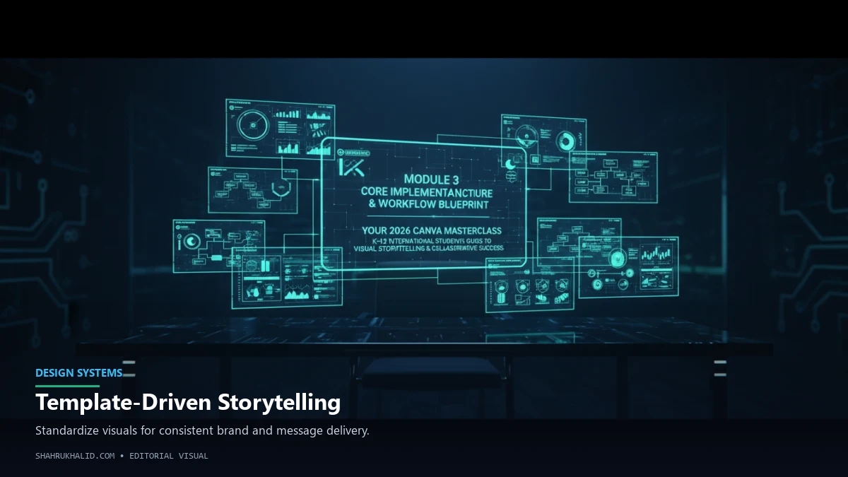
Now that your workspace is set up, it’s time to step into the workshop. This module is where we dissect the core mechanics of Canva. We’re going to move beyond the dashboard and into the editor itself—your creative cockpit. I want you to think of this like learning the blueprint of a car engine. Once you understand how the main parts (the pistons, the spark plugs) work together, you can drive any car and even start to troubleshoot when something feels off. We’ll establish a simple, repeatable workflow that you can apply to any project, from a simple poster to a complex video.
The Canva Editor: A Tour of Your Creative Cockpit
Open up that test presentation you created in the last module. This screen is where you will spend 99% of your time in Canva. It looks busy, but it’s divided into three main zones. Let’s call them the “Toolbox,” the “Canvas,” and the “Control Panel.”
1. The Left Panel (Your Toolbox)
This dark grey panel on the far left is where you’ll find all your creative ingredients.
- Design/Templates: The very top tab. Here you can search for pre-made layouts for your entire presentation or just for a single page. This is your best starting point for inspiration.
- Elements: This is the treasure chest. It contains everything from shapes, lines, and graphics to photos, videos, audio, charts, and tables. The search bar here is incredibly powerful. Searching for “thinking” will give you icons of lightbulbs, illustrations of people pondering, and even short video clips.
- Text: Here you’ll find pre-designed text combinations (heading and paragraph pairings) as well as the basic tools to add a heading, subheading, or body text.
- Brand: If your school has a Brand Kit, their logos and fonts will be here.
- Uploads: This is where you can upload your own images, videos, and audio files. Maybe a photo you took for a science experiment or a voiceover you recorded on your phone.
- Draw: A newer feature that lets you use different pens and highlighters to draw freehand on your design. Perfect for annotating a map or circling a key part of a diagram.
- Apps: This is a more advanced area, but it’s where you can connect Canva to other tools like Google Drive, YouTube, or even AI image generators.
2. The Middle Area (The Canvas)
This is the large, white (or colored) rectangle in the center. It’s your actual design page, your slide, your document. This is your stage. Everything you select from the Toolbox will appear here. You can click on any object on the canvas to select it, move it around, resize it by dragging the corners, and rotate it.
3. The Top White Bar (The Control Panel)
This bar is “context-sensitive,” which is a fancy way of saying it changes depending on what you have selected on your canvas.
- If you select nothing: It shows you options for the background color and options to animate the whole page.
- If you select a text box: It transforms into a text editor, showing you options for font, size, color, bold, italics, alignment, and bullet points.
- If you select an image: It shows you options like “Edit Photo” (where you’ll find the magic Background Remover), “Crop,” “Flip,” and “Animate.”
Spend a minute clicking on different things. Add a text box and watch the top bar change. Then add a photo from the “Elements” tab and see how the options shift again. Understanding this context-sensitive menu is the key to unlocking fast and efficient editing.
The Anatomy of a Design: A Visual Card Structure
Every design in Canva, no matter how complex, is built from simple layers, stacked on top of each other. I want you to think of it like making a collage on a piece of cardstock.
Visual Card Analogy
- The Cardstock (The Background): This is the bottom-most layer. It can be a solid color, a gradient, a photo, or even a video. It sets the entire mood for your design.
- Large Cutouts (The Structural Elements): Next, you might glue down some large shapes or photos that define the layout. This could be a large photo that covers half the page or colored rectangles that create distinct sections for your text.
- Stickers & Icons (The Supporting Graphics): On top of those larger shapes, you add smaller visual elements. These are your icons, illustrations, charts, or smaller photos. They add detail, draw attention, and help explain your concepts. In Canva, these are the graphics you pull from the “Elements” tab.
- The Writing (The Text): The very top layer is almost always your text. Your headings, your labels, your paragraphs. They sit on top of the colors and shapes so they are easy to read.
When you’re working in Canva, you can manage these layers. If you right-click on any object, you’ll see an option for “Layer.” You can “Send to Back” or “Bring to Front.” This is how you control what overlaps what. For example, if your text is accidentally hidden behind an image, you just select the text, right-click, and “Bring to Front.” Easy.
Your Universal Workflow Blueprint: The 4-Step Grid
You will never stare at a blank page and wonder where to start again. For every single project, from now on, you will follow this simple, four-step process. Let’s visualize it as a grid.
| Step 1: PLAN & IDEATE